
Quick Start
.
Download and Install EPIPOI
.
EPIPOI is an executable file written and compiled in Matlab, which can run on Windows PCs and Macs
Follow the simple steps below for downloading and installing EPIPOI :
![]()
Epipoi only currently works on 64-bit versions of Windows. While there is a good chance that this is the case for your PC – especially if its a relatively new one – it is worth checking here first.
The above operation will take a few minutes, but you will need to do this only once.
You can run it by just double-clicking this file every time you want to start the program (therefore it is advisable to download it in a place that is easily accessible – e.g. the desktop).
![]()
Once you unzip and run this file, it will install EPIPOI in your the computer (downloading additional files if needed). This will take a few minutes, but you will need to do this only once.
(thanks Jack for this compilation for Mac!)
Running Epipoi
When you open Epipoi, note that it might take some time to open the program – so don’t worry if you don’t see nothing going on on your screen during up to around one minute (depending on the speed of your computer)
When EPIPOI is started, there are only three buttons that can be activated: “Load External Data”, “Credits” and “About”. Clicking on the former opens a window from which the user can select the example data sets, or load their own data file. You can use the example files (see next section).
After the file with the time-series is loaded, a second window will request a “geolocation” file. If this file, which contains the geographic coordinates of the time-series does not exist – no problem: just click the “cancel” button for this second browser window and EPIPOI will skip over spatial visualization in the analyzes.
And finally a third window will ask “Do you have interpolated population data to use as denominator of the epidemiological data you used?”. This is a cool feature (which allows you to work on incidences calculated “on the fly”) we just added, and it is working well. Nevertheless the example data is not yet available, so please just click “No” when this box opens.
Example datasets
We strongly suggest you to get familiarized with Epipoi by using these datasets. Note that you can use these files as templates to format your own dataset before loading it to the program.
1) Dataset with pneumonia and influenza mortality from Brazil from 1996 to 2010, aggregated by states and month and age* (source DATASUS, Brazilian Ministry of Health) : Brazil_01_Pneumonia_and_Influenza_(1998_2013).xls
2) Supplementary file containing latitudes and longitudes of a reference point (in this case the state capital) for each state: Brazil_02_LAT_AND_LONGS.xls Note that you can’t load this file without loading the #1 above. On the other hand, without this Lat_long file you will still be able to run most analyses, but will be less exciting, as you will not be able to do the ones related with space, e.g. map, latitude gradients, etc.
3) A third question dialog window is going to pop up asking “Do you have interpolated population data to use as denominator of the epidemiological data?”. Just press, then you can load this one Brazil_03_population_interpolated_series_(1998_2013).xls. This file allows epipoi to calculate the incidence through all your time series, for all age groups and states. Is an optional feature (just click “Cancel” when prompted if you don’t have a similar file. But if you have population data, you can easily generate this interpolated population file for your analysis using this other program)
p.s. the files above were used for the study Schuck-Paim et al 2012 Were equatorial regions less affected by the 2009 influenza pandemic? The Brazilian experience. PLoS ONE.
Would you like to get used with Epipoi looking at virus records instead of mortality? No problem! Check this link
Exploring possibilities…
Many of the analytical possibilities that Epipoi offers are available just by clicking the buttons and commands on the user interface (we encourage you to do so) after the dataset is loaded (don’t forget to press the button “seasonality” and then “scatterplots”). Another good idea is to read the paper that explains Epipoi’s capabilities (but note that we keep improving and adding features, so the version of Epipoi that you will be downloading is even more complete and cool than the one described in the reference paper).
To make Epipoi even simpler and help users take full advantage of the program, we plan to add videos with tours on how to use Epipoi. We also use Epipoi for lectures and workshops on epidemiological time series analyses. Contact us if your institution is interested.
Now enjoy it!
Some further information for preparing your own data files
Once you are familiarized with EPIPOI using the example data set, you are probably excited to start analyzing your own data. You can simply edit the example data set to use it for your data. The structure of the data in your Excel spreadsheet is quite simple, but needs to be done in the correct way. You might want to check below the instructions to make sure your data is “in good shape” for EPIPOI.
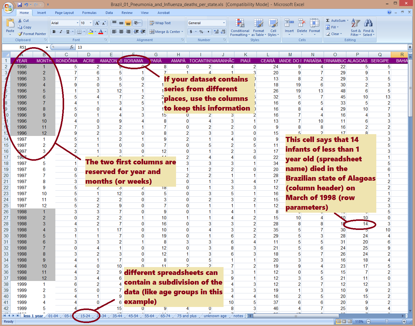
So, the spreadsheet of the Excel file containing the time-series (figure above) should comply with the follow standards:
1) The rows of each time series must be sorted in ascending chronological order.
2) Each row corresponds to an observation from a single time period, for example: row one for January/2001, row two for February/2001, and so on.
3) All time-series (columns) must contain the same number of time points (i.e. one month, week -or whichever unit used) and equally all time series in the file must cover the same dates (rows).
4) The sequence of time should start from the beginning of the first year (e.g. January) and end at the last unit of the last year included (e.g. December), and with no gaps (e.g. a row for February/2000 cannot be missing, even if there is no data for this month – in which case leave that space next to the date empty).
5) The first column needs to contain the year, which should be repeated in all rows with observations from that year (see example).
6) The second column needs to contain the sub-annual unit of the data (e.g. “1” for January, “2” for February, etc or 1 to 52 for weeks). All years must contain equal number of units (i.e. some years cannot have 53 weeks while others have 52 weeks)
7) The following columns should contain the actual time-series data.
5) The headers row (the first row in the file), should contain the following text: “year” for the first column, “month” (or “week”, etc as relevant), then the name of each time series. It is helpful to keep names meaningful, but short (for instance just the name of the state where each time-series comes from, like “Rio de Janeiro”, “São Paulo”, etc)
Last, you will need to save your data set in the Excel “.xls” or “.xlsx” format. Make sure the name of the spreadsheet with your data does is not “spreadsheet”, “notes” or “ignore” (these spreadsheets will be ignored – what is actually useful because it allows you to keep relevant notes and details associated with your data there).
By the way… You can use different Excel spreadsheets within your workbook for data that is disaggregated (for example, each spreadsheet contains different age groups). This is actually a very exciting feature because it gives you a “third dimension” for your analyses, perhaps exploring the changing seasonality between age groups as well as places. Inspect the different spreadsheets in the example data Brazil_01_Pneumonia_and_Influenza_(1998_2013).xls you downloaded above to understand how this system works.
An additional tip for when you prepare your “Supplementary file containing latitudes and longitudes” : you can add a fourth column with some sort of aggregation of your sites, like “regions”, “states”, “climatic zones”, etc. (again, see the example file to check how it can be done). This will allow you to visualize those regions in different colors when you are plotting the parameters extracted using the “scatterplot” option (and then pressing the “groups” button). You will love it!
And by the way, if you would like to perform some original research, but haven’t got data yet, here is a place where you can find plenty of it: Project Tycho (feel free to email us in case you would like do perform some study in collaboration with this dataset or another one)